Neuerburger Treffpunkt – Kiosk & Bakery
On 5 October 2026 a new place opened in Neuerburg: kiosk, bakery and post office drop-off in one, right on Marktstraße. A meeting point, as the name says. And that’s exactly how it should look: warm, local and a little bit handmade.
What I did
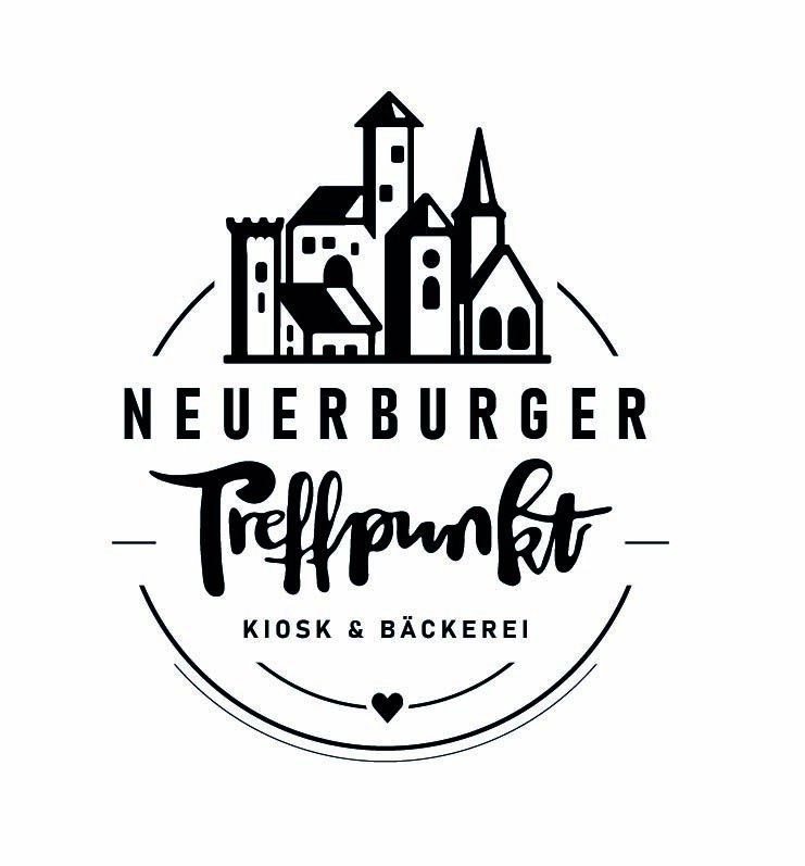
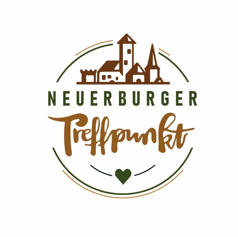
- Logo – a hand-drawn skyline of Neuerburg with its castle and church towers, plus hand-lettered “Treffpunkt”. In two versions: detailed for large surfaces, slim for small formats.
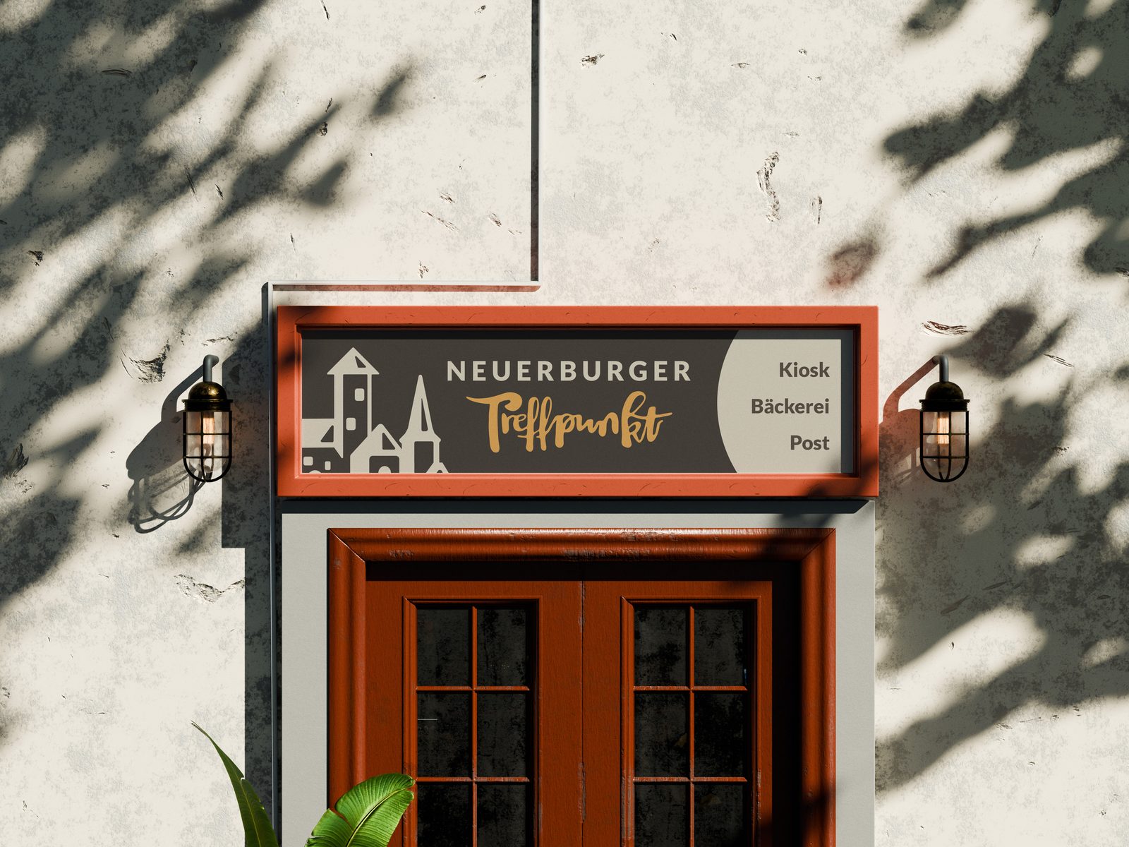
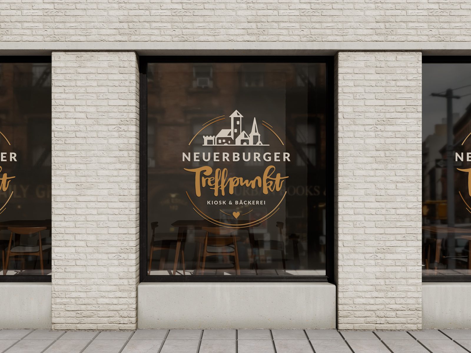
- Storefront – facade sign and window graphics
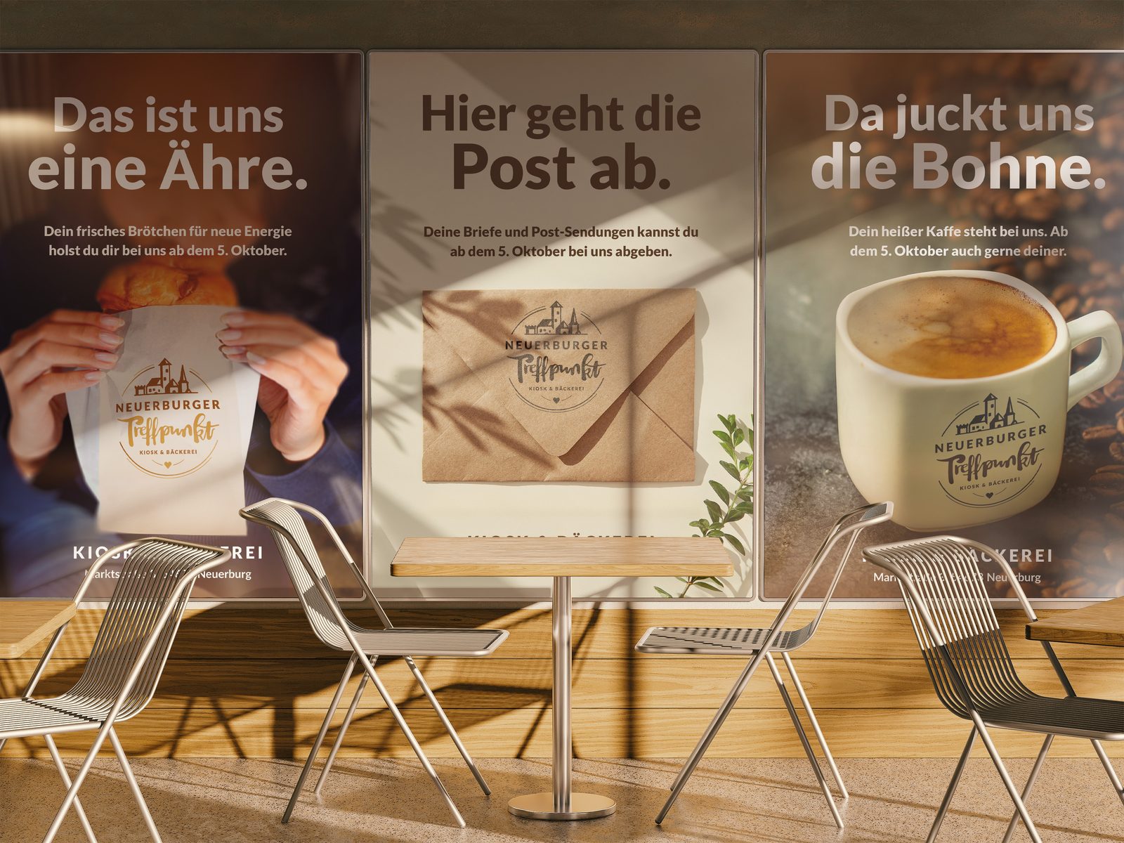
- Opening poster series – three German puns about bread, mail and coffee
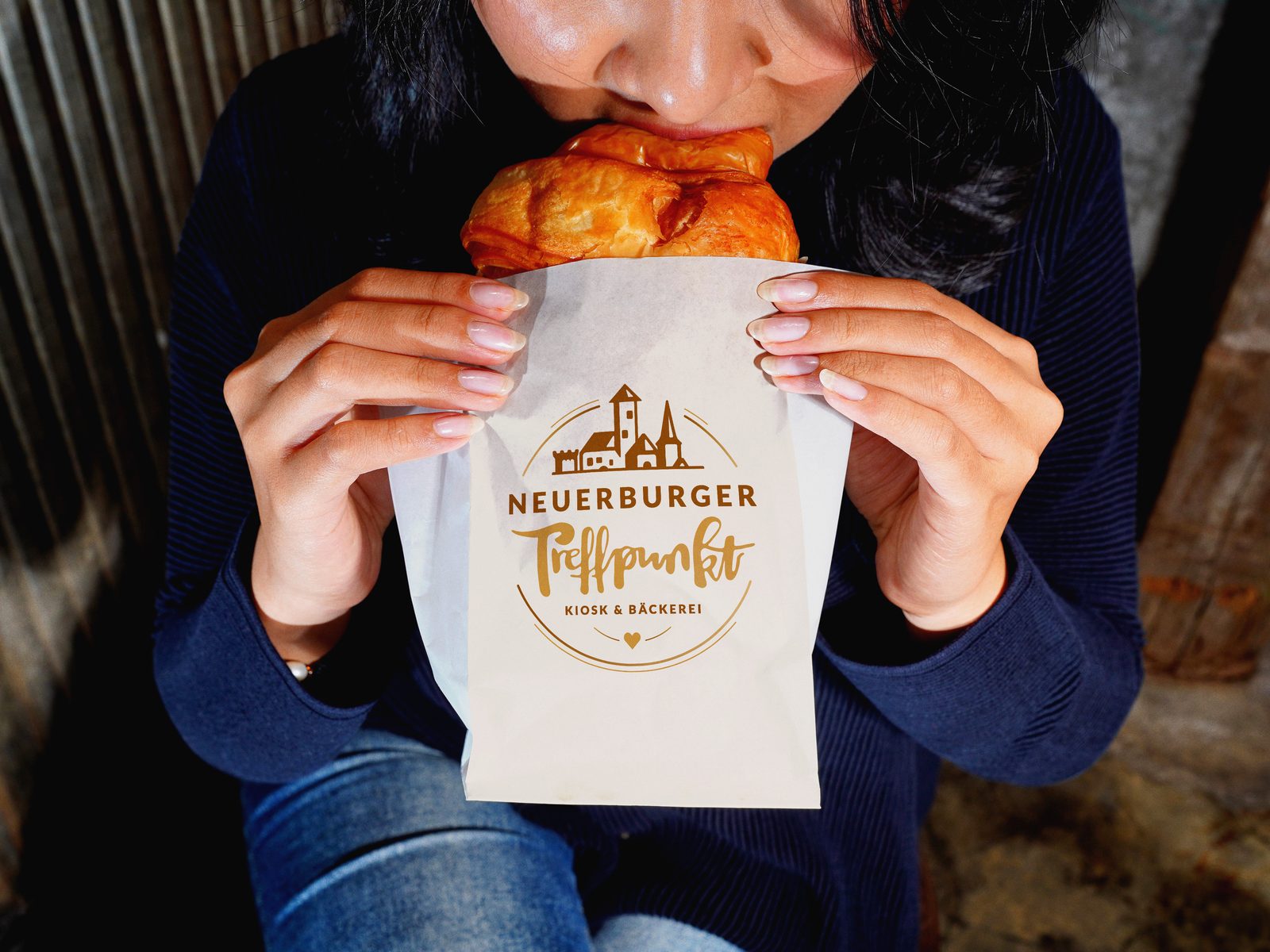
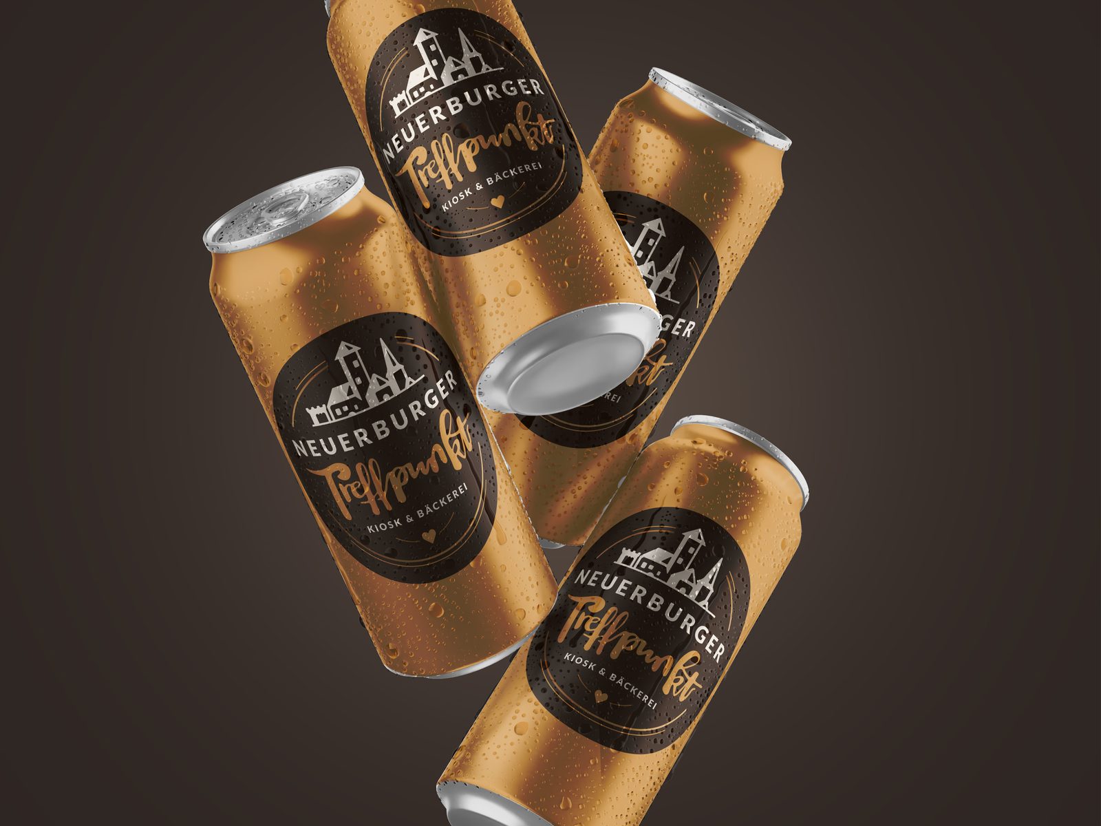
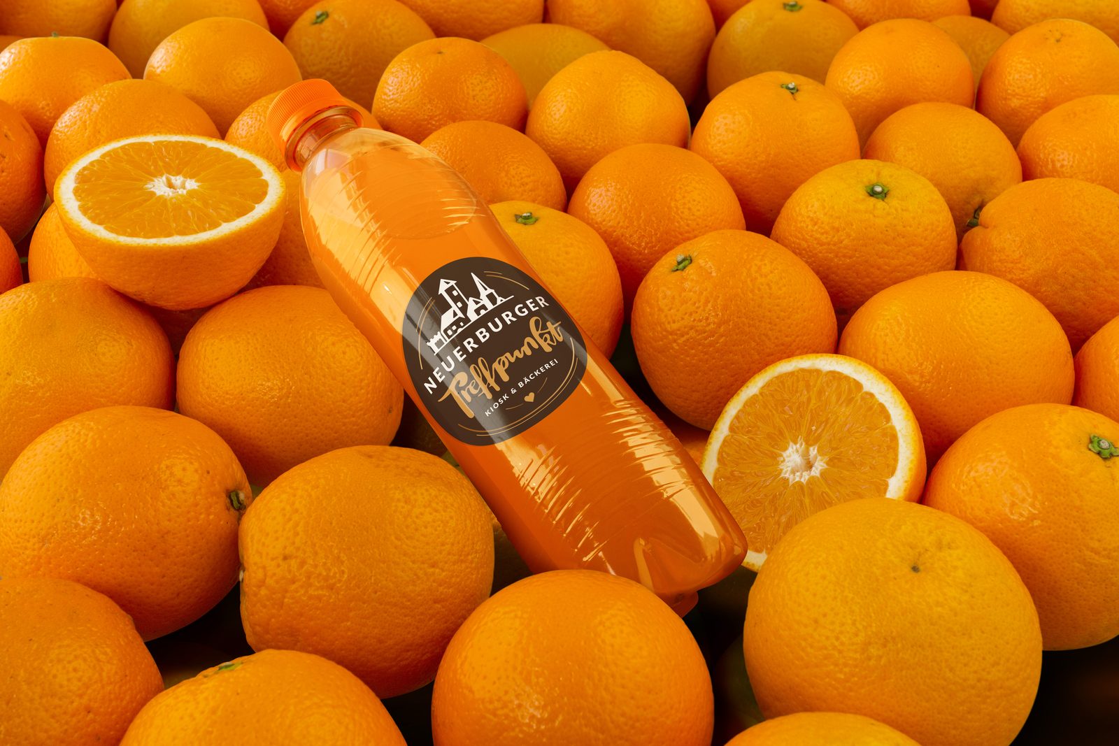
- Product motifs – bread bag, drink can, juice bottle
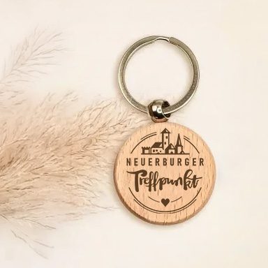
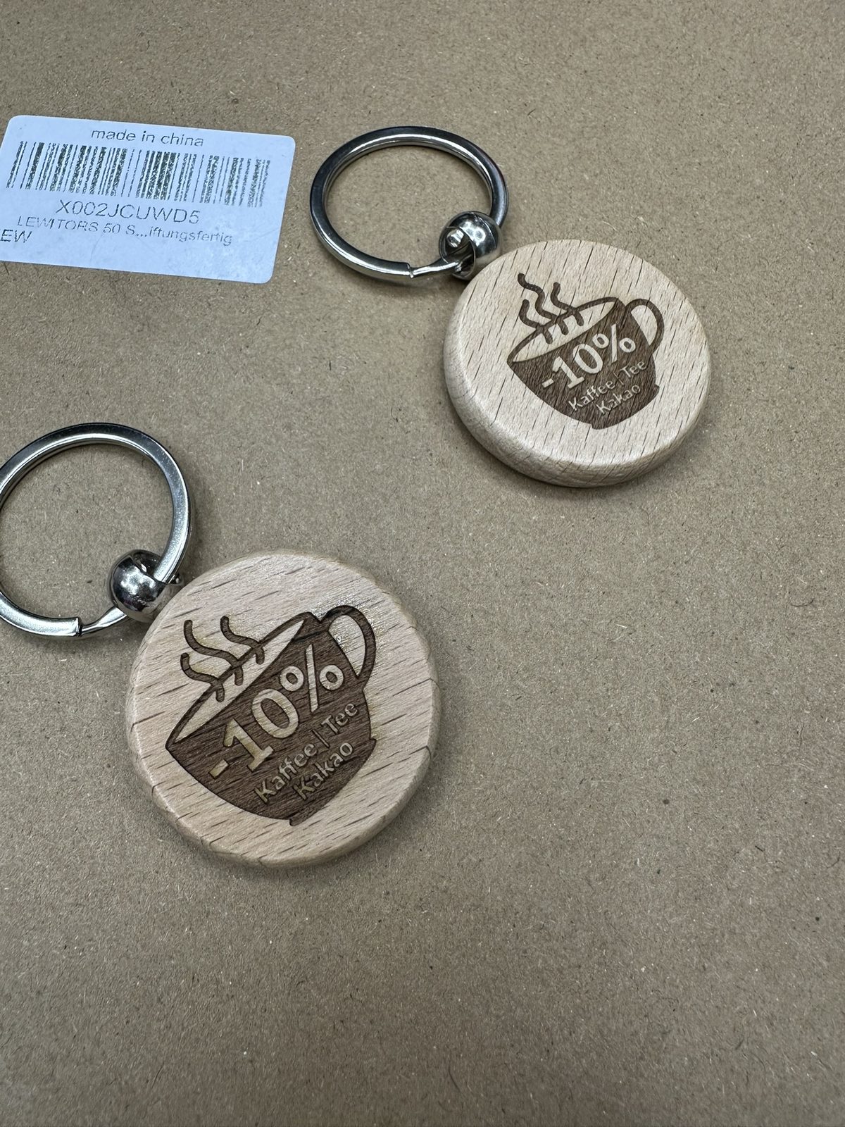
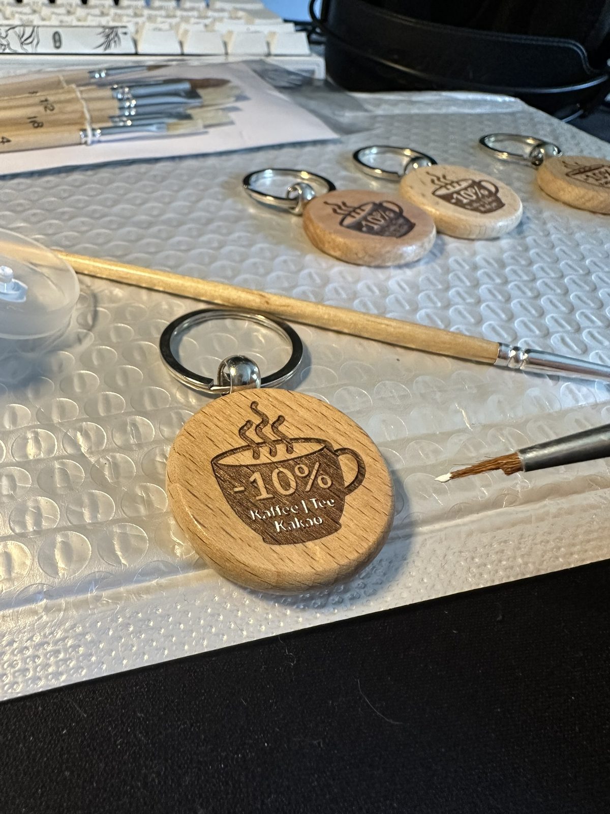
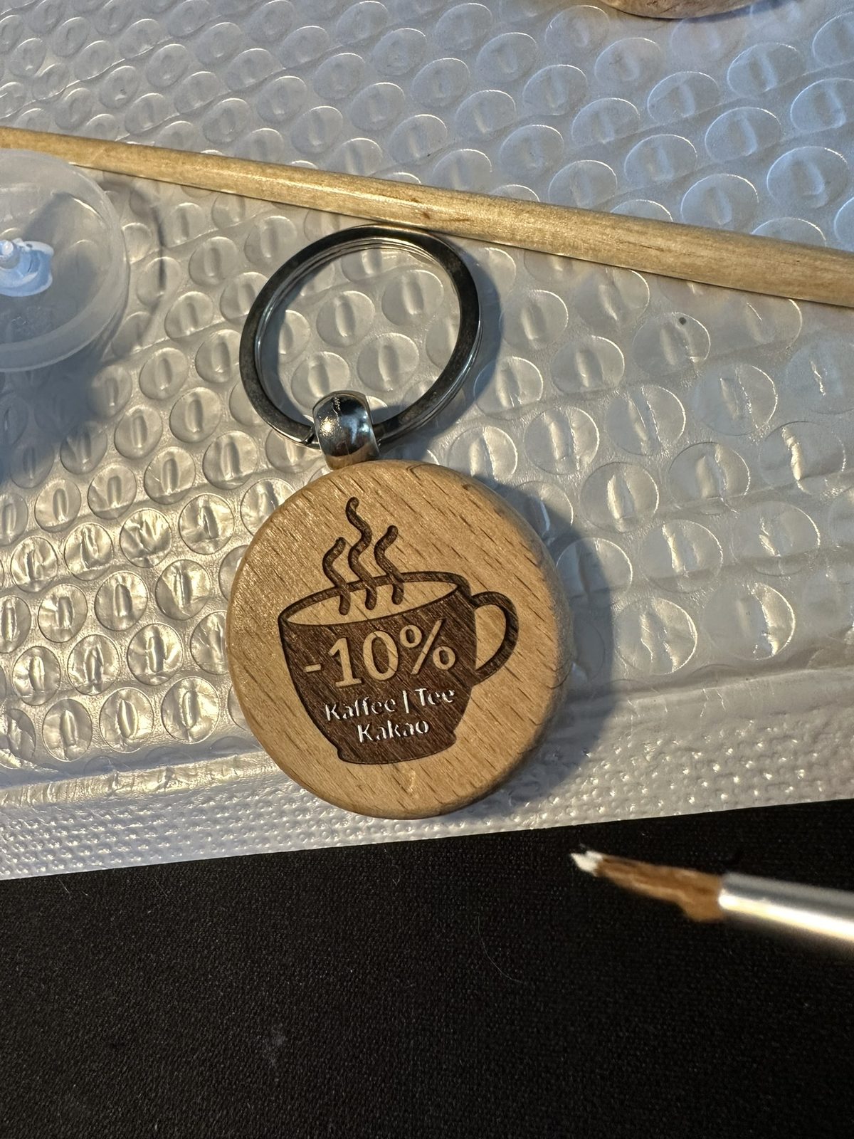
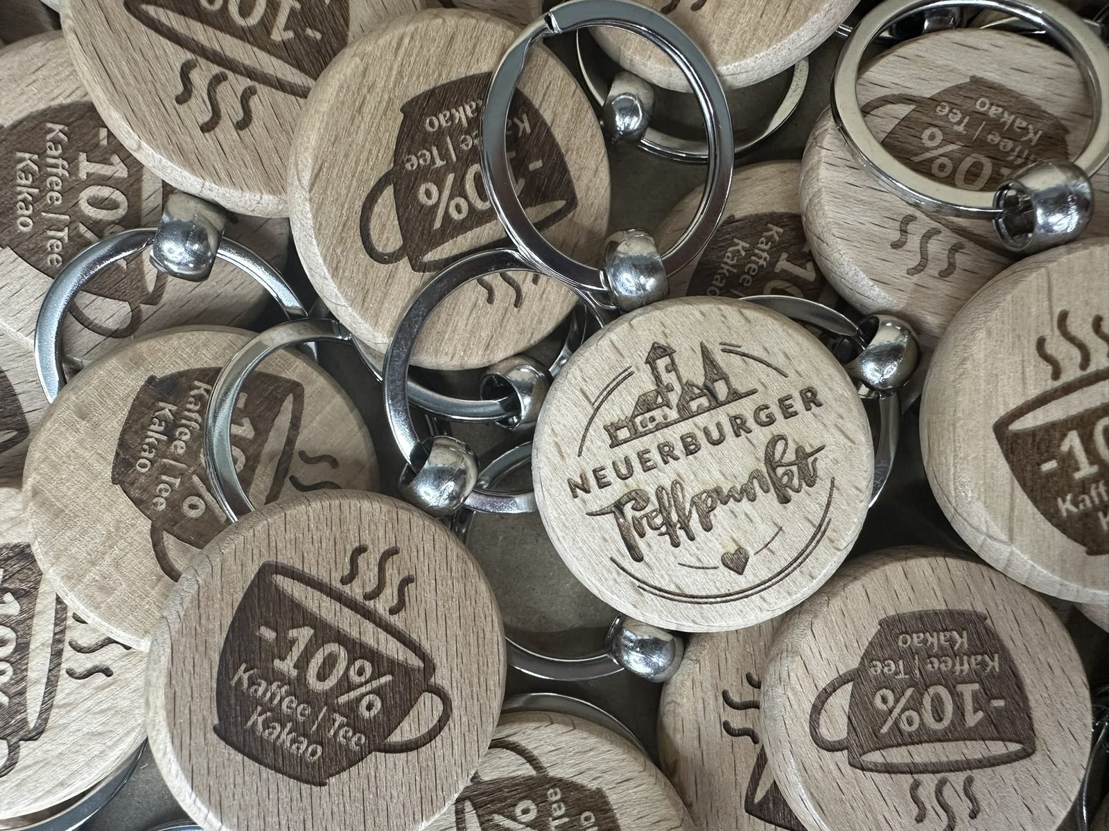
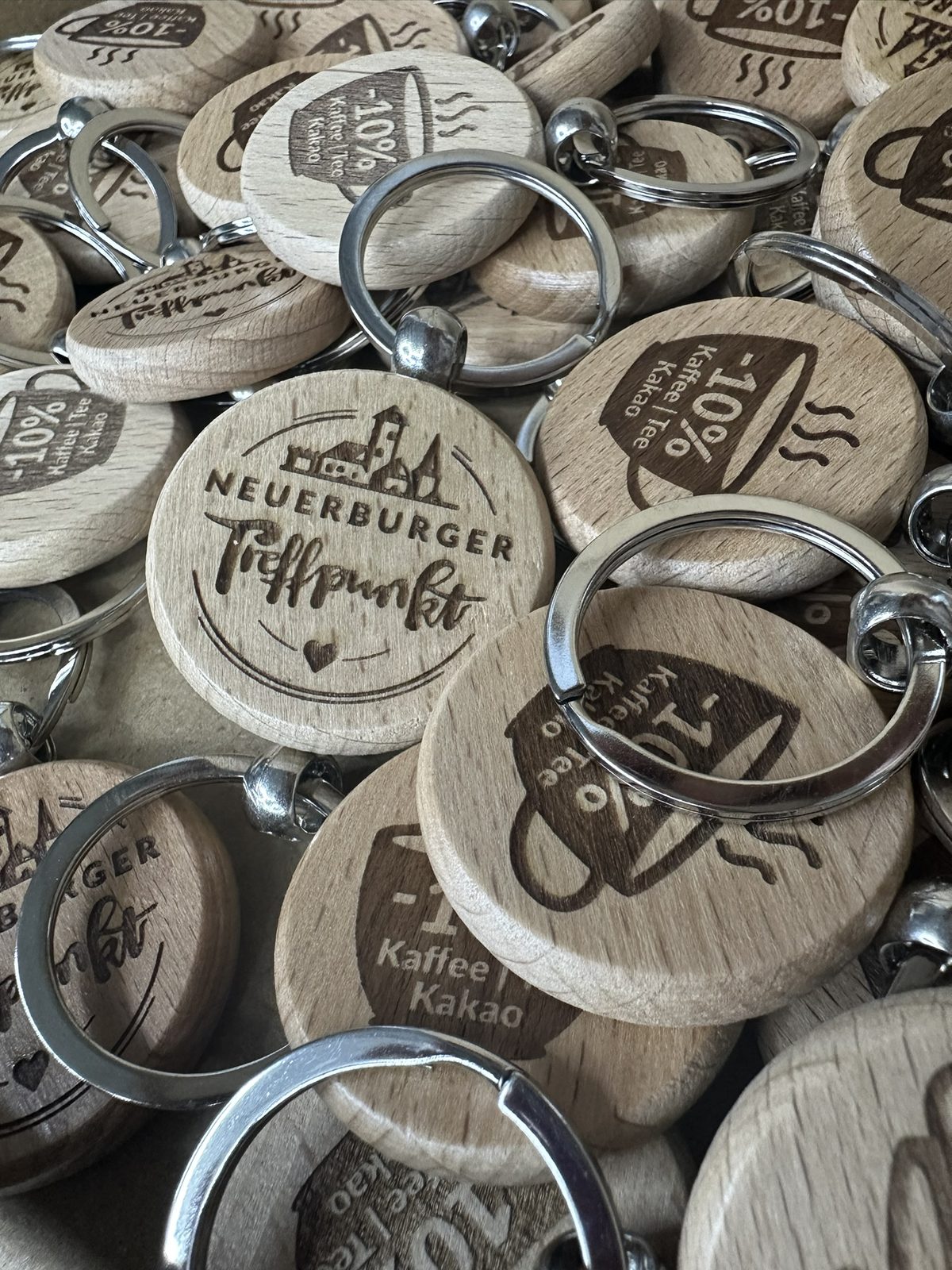
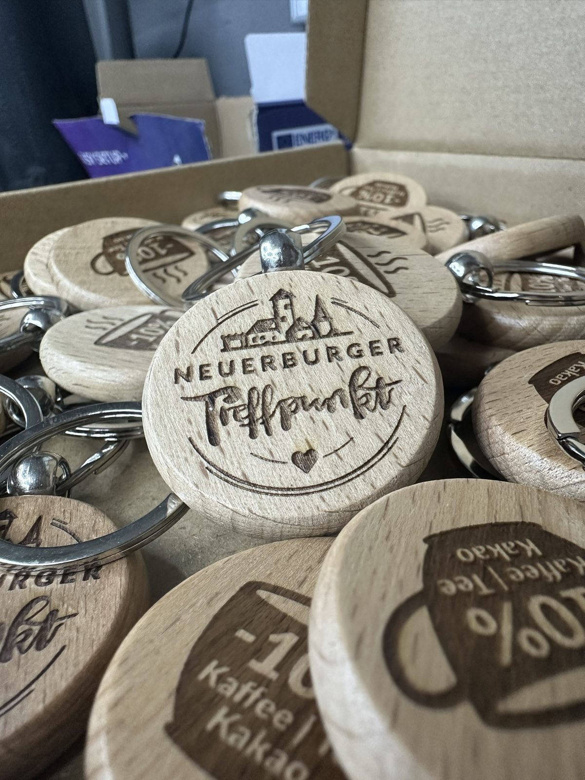
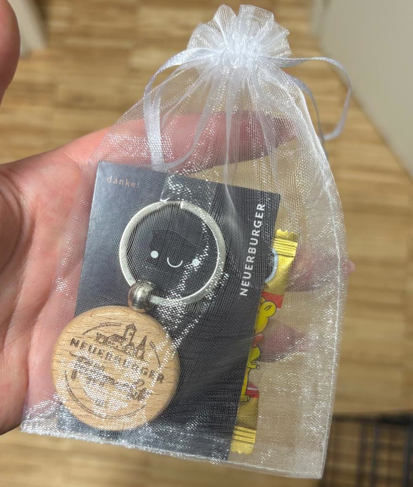
- Wooden key rings – logo on the front, 10 % off coffee, tea and cocoa on the back. Laser-engraved in series.
- “danke!” card – black backing card for the key rings, with a smiley and lettering.
Approach
A small-town kiosk isn’t a lifestyle concept, it’s where people bump into each other in the morning. So no slick corporate look, but a handwriting: the skyline shows the town as locals know it, the lettering is drawn by hand, and the posters talk with a wink, the way you’d chat at the counter.
On the posters, the logo deliberately doesn’t stand alone. It sits on what you actually get at the Treffpunkt: a bread bag, a coffee cup, a cold drink, an envelope. Nobody knows a new logo yet, but for the opening it still needs to make some noise. If you’re not well known yet, it pays to show the product right alongside it. People then link the logo to something they already know, and it sticks.
From line to silhouette
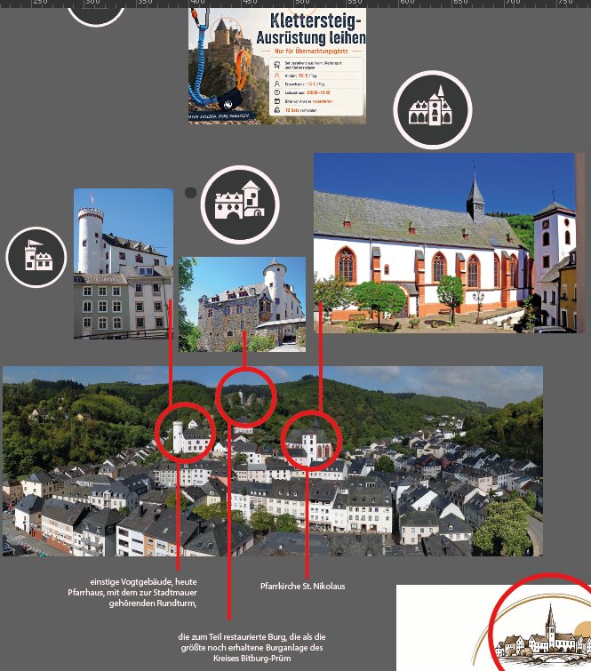
Before drawing anything, I took Neuerburg apart: reference photos of the castle, St. Nikolaus parish church and the round tower by the old bailiff’s house, marked on a panorama of the town. Those are the three silhouettes you can see from almost anywhere in town.
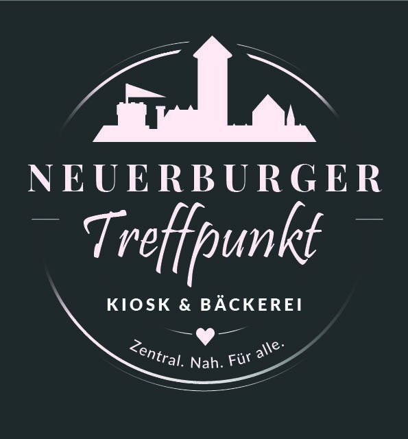
The first iteration was a flat silhouette with a script font. Clean, but generic. It could have been any small town.
So, back to paper. Castle and old town drawn by hand, with hatching and crooked roofs, and the lettering drawn by hand too.
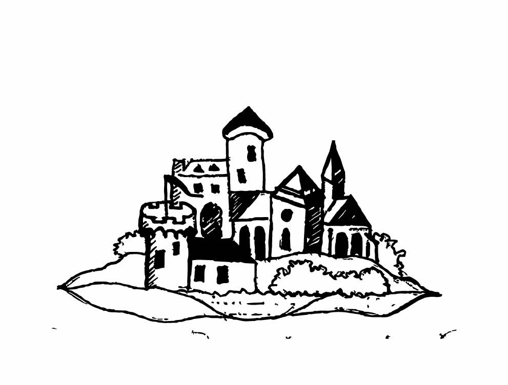
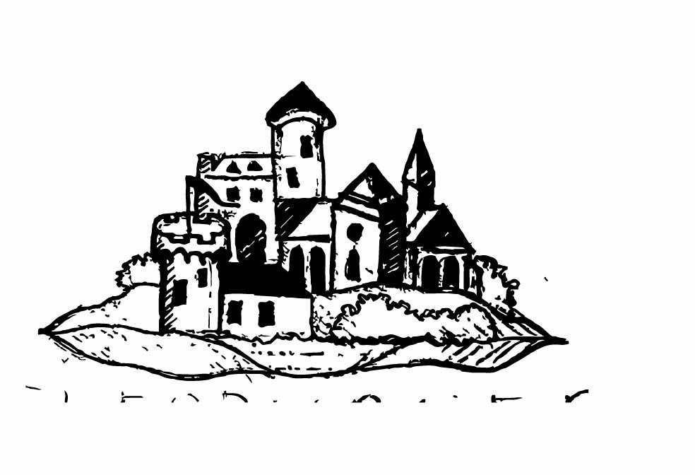
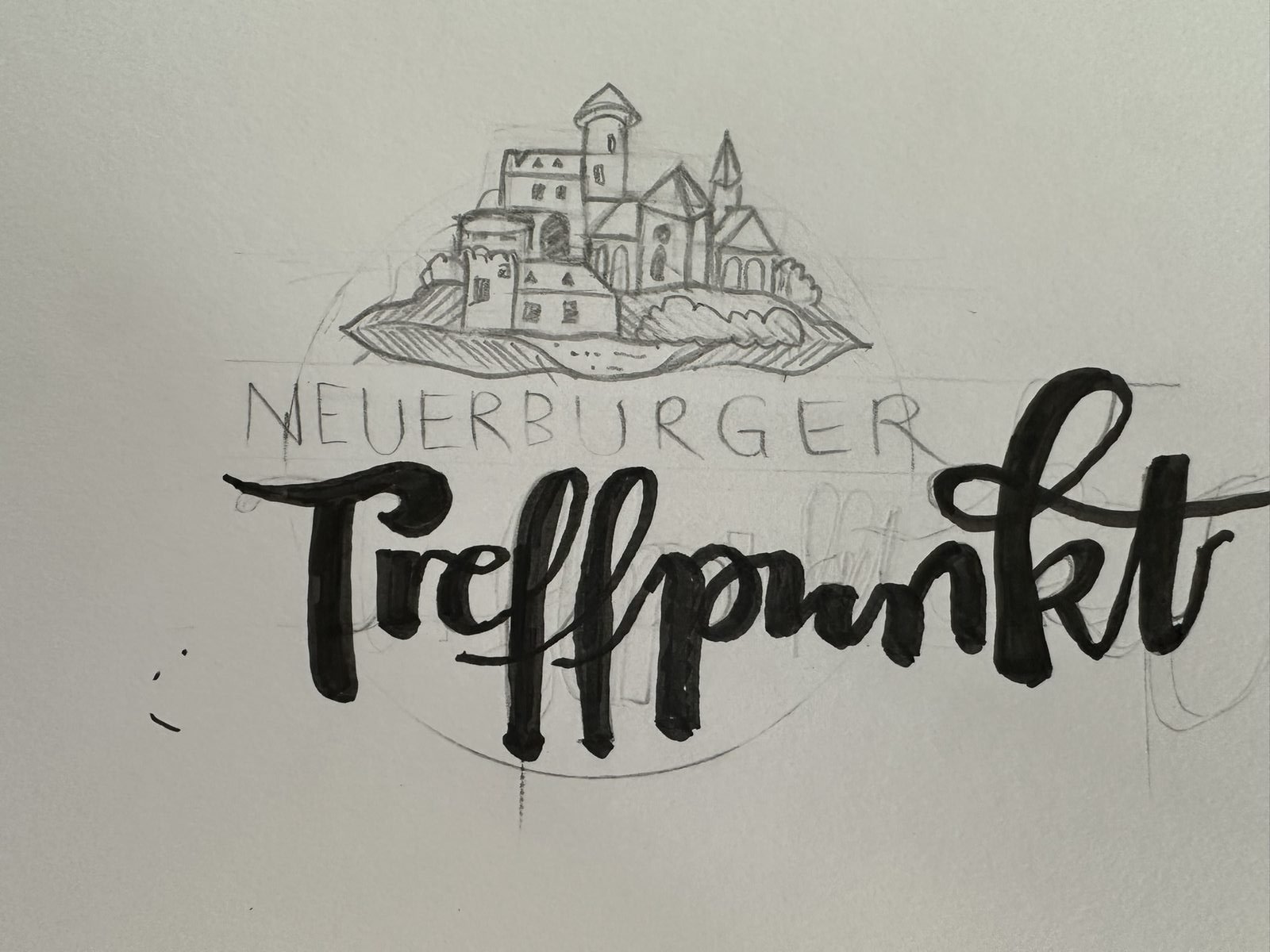
That turned into a fine line drawing. Detailed, charming, and at large sizes exactly what I wanted.
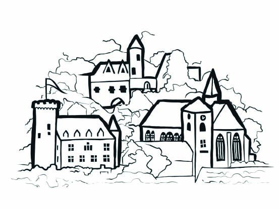
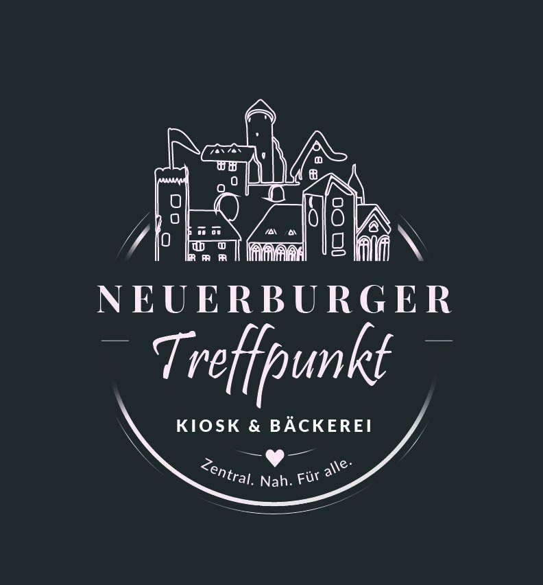
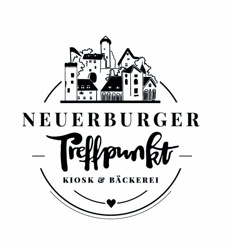
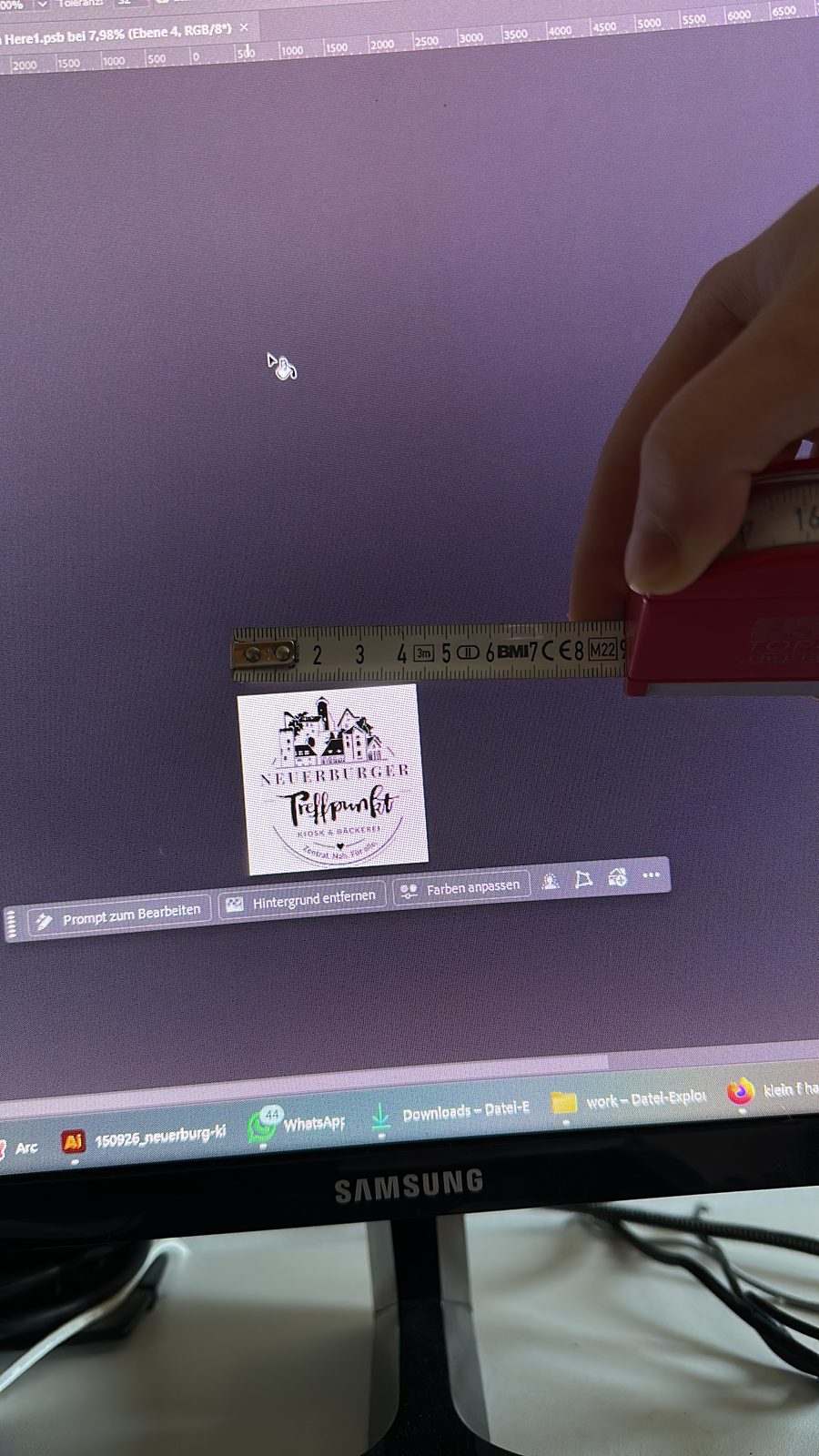
Then came the stamp-size test, and it didn’t hold up. The fine lines clog, the castle turns into a grey smudge. On a key ring, a bread bag or a social media avatar, nothing would have been left of it.
The answer was two versions: a detailed one for large surfaces like the sign and posters, and a slim one for small formats. Bolder silhouette, fewer lines, and the hand lettering holds both together.
It landed
Sign above the door, poster at the entrance, and the first guests sitting outside in the sun. No longer a mockup, but the real thing.
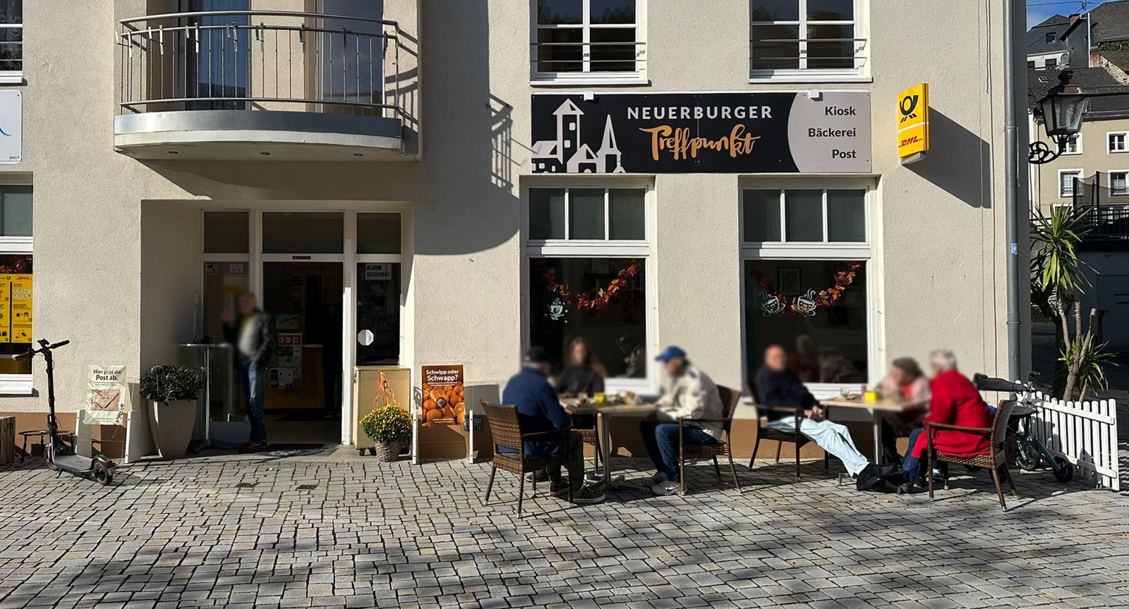
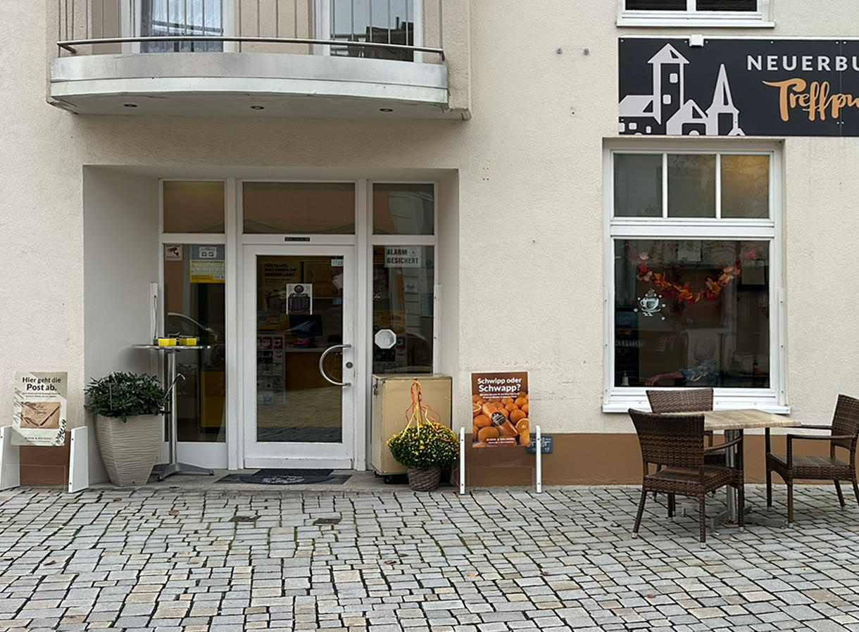
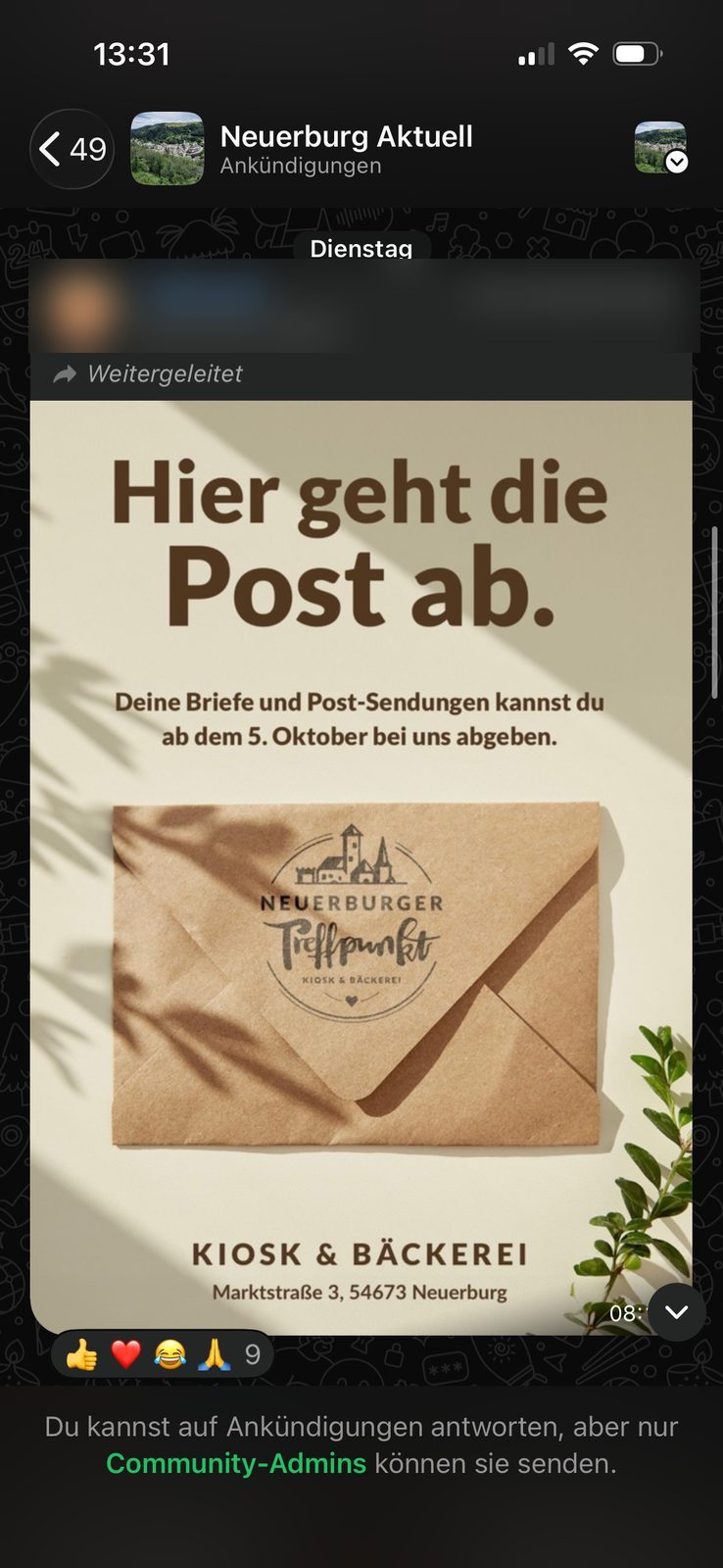
The best feedback: the post office poster was shared in the town’s WhatsApp community “Neuerburg Aktuell” and brought the opening straight to everyone’s phone.
The key rings
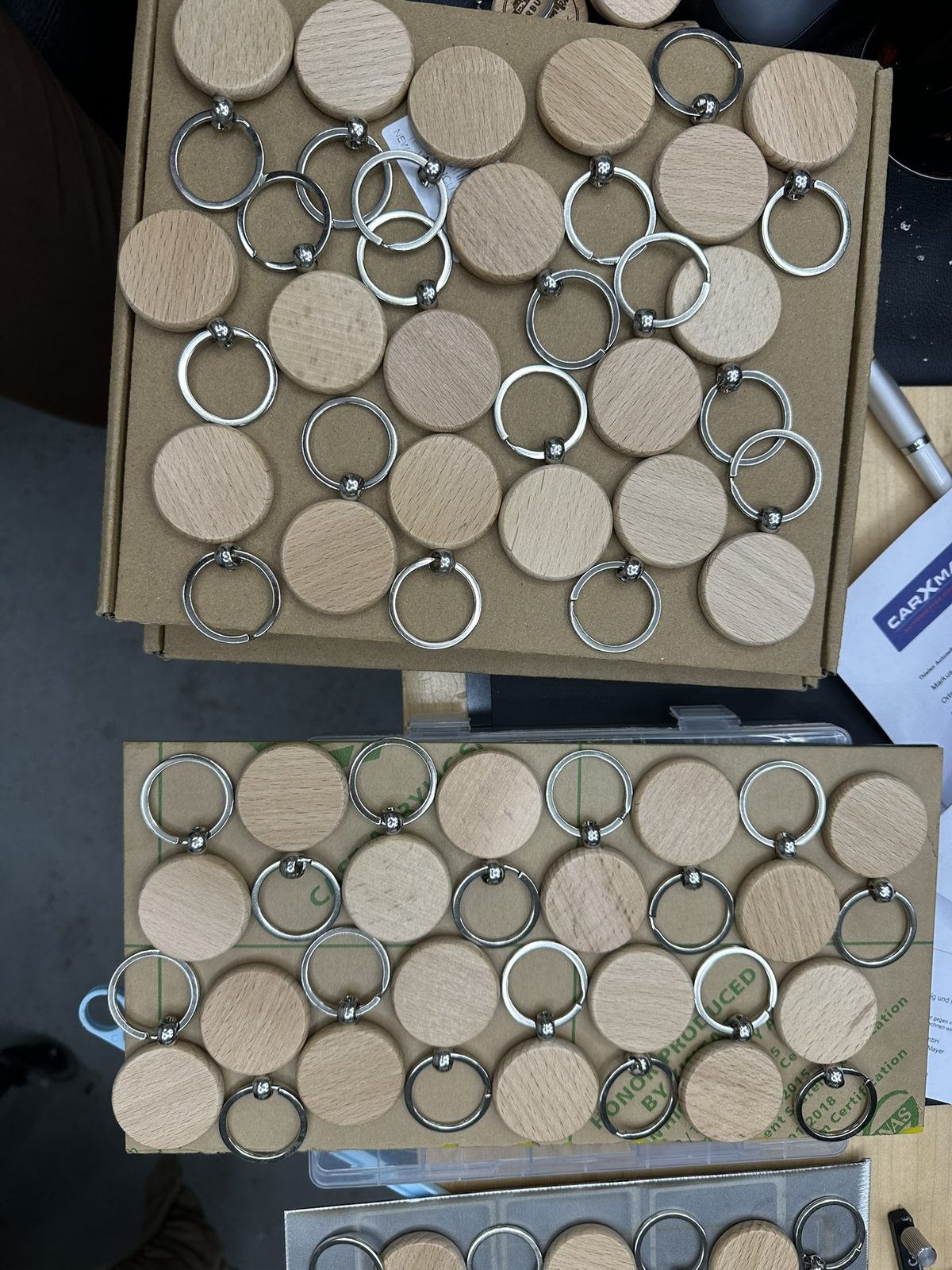
Beech wood, laser-engraved. Everything is set up in the laser software first: place the logo and the discount motif, set power and speed, lay out the blanks. Then it is time to watch.
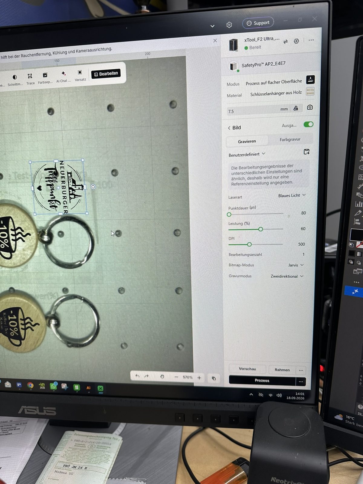
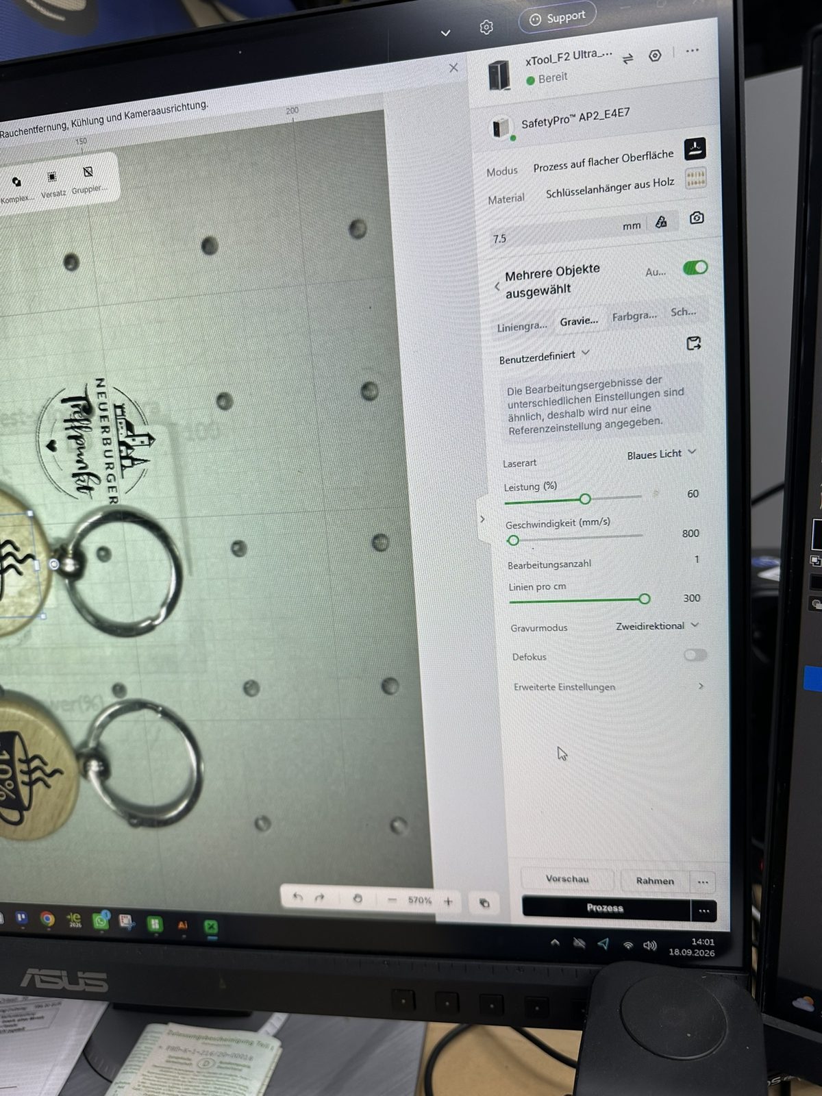
Before the full run, there were test engravings, front and back, with different settings side by side.
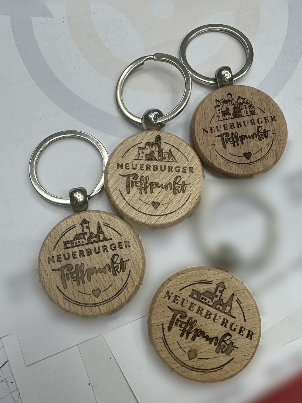
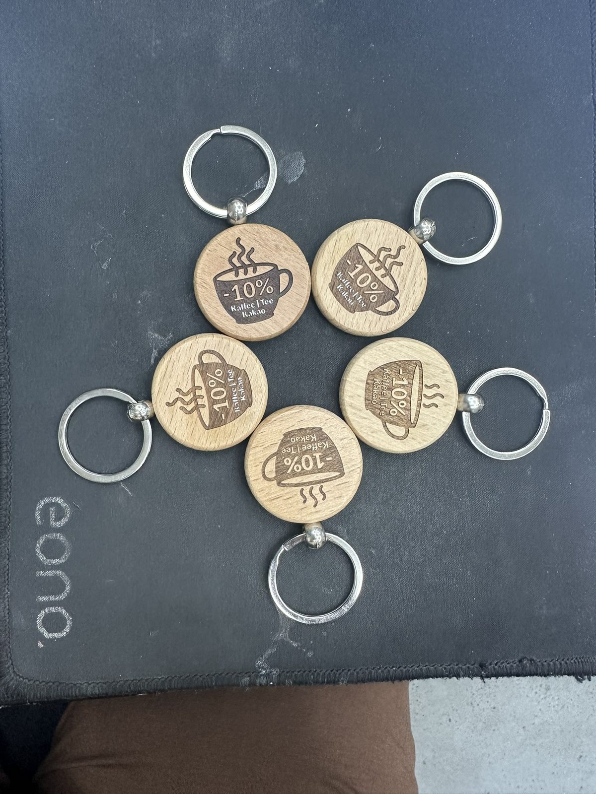
The logo side worked right away. The back didn’t quite: the small letters burned into the wood on the first runs. Instead of starting over, I rescued them letter by letter with paint and a fine brush, and adjusted power and speed for the next runs.
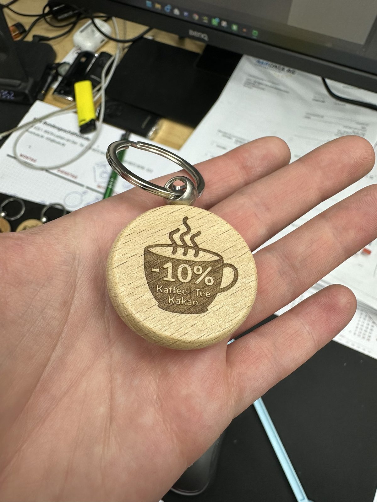
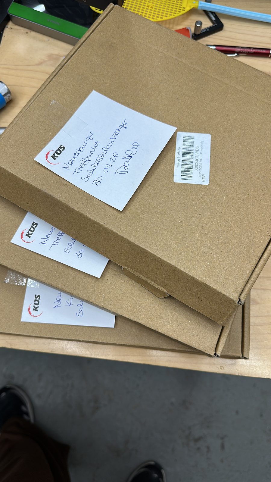
In the end the whole batch sat in boxes, ready for the opening.
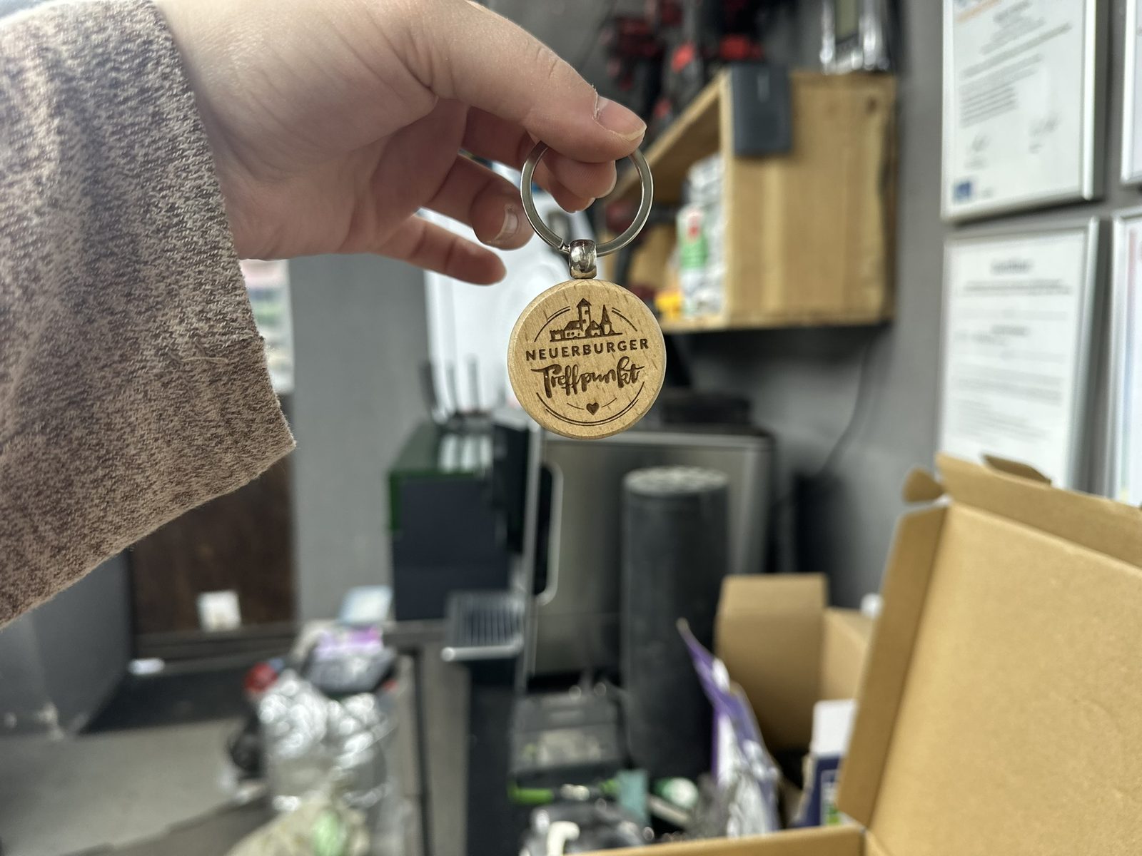
This is how the key rings reach the guests: on a black “danke!” (thank you) card that I designed to go with them. Angelina then packed them into organza pouches with gummy bears.
And then there was a deal
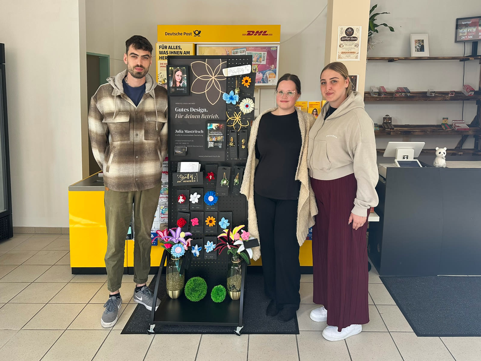
Instead of an invoice, I got a spot in the shop: since 12 October my own display has been standing in the Treffpunkt, advertising my design work and selling my handmade pieces. The story behind it is on my German-language blog: Goldener Oktober.